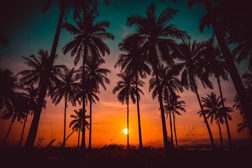
In the Northern Territory we are blessed with the natural colour palettes on our doorstep. From jaw-dropping sunsets in magenta, orange and red to the outback ochre contrasted against a pale blue sky, we have inspiration all around us.
However, when it comes to deciding on the colours to use in your design, are you able to draw from nature?
Many businesses in Darwin, Katherine and Alice Springs use the Territory colours in their corporate branding. These colours are of course taken from the NT flag and are ochre, black and white. And the Darwin City Council uses blue and green, which reflects the colours of our harbour, rivers, mangroves and bush.
Whether you have an existing logo, need a brand new one, or are deciding to re-brand you need to consider what colours you want to represent your business. Colour selection can, of course, be taken from nature; however, they still need to match colour rules and represent the style of your business.
All colours have implications for logo and promotional design. The use of colour conveys meanings and whether it is conscious or unconscious we all respond to different colours in similar ways.
Have you noticed that all major fast food brands use red in their logos or on their packaging? Think McDonald’s, Pizza Hut, Red Rooster and KitKat. The colour red is considered exciting, youthful, powerful AND has been found to stimulate appetite.
In the Territory, the colours Ochre, White and Black give us all the feeling of a local, Territorian business, however, use of these combinations for national and international business would not elicit the same response. It is our knowledge and association with the Territorian flag that gives us these reactions.
So, what about using those bright colours from our sunsets and sunrises?
The colour orange elicits emotions of warmth, energy, health, optimism and clarity. Whereas yellow is both happiness, optimism and caution.
Pink is a very feminine colour and one to be used with caution unless it will specifically enhance your brand positioning.
Luxury brands often use rich and deep purples which represent royalty, creativity and magic. This year’s PANTONE colour of the year is an Ultra Violet colour. If you are interested check it out here https://www.pantone.com/color-of-the-year-2018
Authority & trust in logo design
Green and blue are colours most commonly used in financial, banking and accounting industries. These colours elicit emotions of trust, dependability, growth and strength. Green on its own also represents peace and nature.
White & Black in Logo design
White and black can be used in logo design as elements and no matter colours you choose, it is advisable to have both black and white versions of your logo for use in instances where your logo cannot be printed in colour or goes atop another image.
No need to feel limited by logo colours
If you only have one or two colours in your logo, this does not need to limit your overall marketing and branding. Many businesses in their brand guidelines have complementary or contrasting colours that work well with their logo and are used in their collateral or on websites.
If you want to know more about colour choices for your logo or in your branding, talk to us and we will help to represent your business in the best light.


