Every detail on a label contributes to capturing the product’s benefits, features and feeling.
That’s a lot to ask from a small label or product sticker.
However, for our Darwin product label design team, it’s a challenge that keeps us motivated to find the most impactful combination of elements.
One element that has a profound impact on purchase decisions is colour psychology.
We have recently been delving into colour theory here at Colemans Labels, and we wanted to share a few insights into how strategic colour use can transform your product labels from stock-standard to sublime.
Colour psychology in design
Colour psychology is the study of how hues affect human behaviour.
This fascinating field suggests that our reactions to colours are often subconscious, yet they play a significant role in evoking emotions and generating a specific response.
Different colours and combinations have the power to influence how we think and feel about a brand.
- Red is often used to grab attention, stimulate appetite and convey urgency. It’s prevalent in clearance sales, fast food chains and emergency services.
- Blue is favoured by financial institutions, healthcare providers and technology companies to project calmness, trust, stability and professionalism.
- Green is widely used in eco-friendly and organic products to symbolise nature and sustainability. It also suggests health and tranquillity; look out for green on product labels in Darwin health food stores.
- Yellow is youthful, evoking feelings of cheerfulness and stimulating mental activity. It’s used to create a sense of optimism and to communicate caution, like in product stickers carrying health warnings.
- Orange combines the energy of red and the happiness of yellow. It’s often used to draw attention, such as product labels and shelf tags advertising a discount.
- Black is versatile, elegant, mysterious and sophisticated all at once. Scan product labels in Alice Springs and Darwin to see how black can be used on luxury products, power tools, high-end fashion and technology.
- Purple is associated with royalty, luxury, wisdom and sophisticated mystery. Brands mostly use it to convey a sense of premium quality on product labels, especially to subtly contrast black.
- White is clean, simple and pure. It’s especially popular in healthcare, minimalist design, and brands aiming to project transparency and sincerity with clean product packaging.
- Pink product labels often target female audiences (not always successfully), evoking feelings of romance and tenderness. It’s also used to convey playfulness, especially in lighter shades.
While there’s much more to say about colour psychology, a fundamental understanding is enough to make product label design decisions that resonate with your target audience.
Colour choices in product labelling
As well as direct emotional responses, colour can influence less obvious perceptions, such as the taste of food.
In fact, one scientific study named colour “the single most important product-intrinsic sensory cue when it comes to setting people’s expectations regarding the likely taste and flavour of food and drink”.
Although this was more about food colouring, there is a lesson for product label designers.
A well-designed label using carefully chosen colours can make your product stand out on the shelf, sway purchasing decisions and even affect the buyer’s perceptions of quality.
What this means for product and sticker labels in Darwin and Alice Springs
Here in the Territory, where the market is as diverse as the landscape, colour schemes that resonate with the local context can enhance the appeal of your brand’s offerings.
One reason is that colour psychology is not universal.
What works in one region may not resonate in another, making it essential to consider cultural perceptions and associations with certain colours.
For Darwin and Alice Springs businesses, this means designing product labels that respect, reflect and resonate with local values.
For example, red hues have a unique ability to evoke nature in the sunburnt Territory environment.
Bright blues can be calming and coastal, or optimistic like a cloudless sky.
Colour combinations like orange, white and black are also closely tied with Top End culture.
The colours on your product labels should always match your overall brand palette, but using familiar colours strategically can create an intrinsic connection to local life.
Colour psychology trends for product labelling
Colour trends come and go, even as the underlying psychology remains consistent.
Updating product labels to evoke emotion and stay ahead of the curve is the peak of colour psychology in practice.
Be bold
Bright and bold colours are increasingly popular in consumer product stickers and labels. This trend uses pops of vibrant colour to create eye-catching labels that capture attention.
Lo Bros kombucha shows us how it’s done. The brand’s 2022 diverged from the trend of natural tones and pastel colours, instead using bold, bright colours to stand out on increasingly crowded shelves.
Keep it clean
A minimalistic design approach is gaining traction. This trend emphasises essential information without overwhelming consumers with excessive details or clashing colours.
BlueScope’s 2013 rebrand is a great example of a simplified brand that still allows for bold colours to come into play.
Play with colour
As a counterpoint to minimalistic design, fun and playful colours are becoming popular in product labels.
Pops of orange, yellow and green offer a fresh and energetic look for brands like Australia’s Own alternative milk.
Go digital
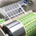
Advances in digital printing technologies have made custom product stickers and labels more accessible and affordable.
More an evolution than a trend, new solutions allow for short print runs and enable brands to experiment with designs, colour palettes and spot treatments without significant cost implications.
What’s next: Practical tips to create high-impact product labels in Darwin and Alice Springs
We predict that the next few years will see a significant evolution in the sophistication of packaging.
High-quality product labels and stickers are now within reach for small brands.
Designers have new AI tools to enhance the impact of colour psychology in product label design.
Innovative technology and methods allow for spot treatments, variable printing and bespoke label sticker printing.
Eco-friendly materials are becoming more affordable and higher quality.
Looking at all these trends emerging at home and worldwide, it’s easy to see why Colemans Labels is excited for the next era of product packaging.
As Darwin’s label and sticker printing partner for over 70 years, we have seen firsthand how a high-quality product label contributes to building local brands – and we’re excited to share that experience with you.