From the ancient Greeks to the Mona Lisa to the Pepsi logo, the Golden Ratio is as prolific as it is intriguing.
This mathematical phenomenon – known by many names, including the Golden Mean, Divine Proportion or simply the Greek letter ϕ (Phi) – has a loyal following among creatives who believe it’s the key to timeless logo design.
Others argue that the Golden Ratio is overused, and logos that rely on the ratio run the risk of looking repetitive and uninspired.
So, is ϕ really the most aesthetically pleasing ratio to the human eye? And what does it mean for your brand’s logo?
It’s a common conversation among our Darwin logo design team, so let’s look closer at whether the Golden Mean is a marvel or a myth.
What is the Golden Ratio, exactly?
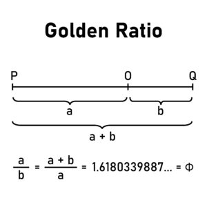
In simple terms, the Golden Ratio is a mathematical ratio of 1:1.618. In slightly less simple terms, the Golden Ratio appears when the balance between two numbers is the same as the ratio between their sum and the larger of the two quantities.
If numbers aren’t your thing, it can help to visualise a spiral that expands at a consistent ratio.
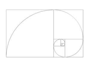
Depending on whether you’re mathematically minded, design-oriented or naturally curious, you might recognise the Golden Spiral as the Fibonacci sequence, any of hundreds of logo designs, or a seashell.
Thinking about your brand identity? Request a free design consultation
From the ancient pyramids to Pepsi: Tracing the Golden Ratio in history
The Golden Ratio was first noted around 300 BCE in Euclid’s Elements, although it’s possible that earlier bright minds recognised the proportion. A few centuries later, in 1509, Italian mathematician Luca Pacioli published De Divina Proportione, which praised the “Divine Proportion” as a mathematical distillation of pure natural beauty.
Who illustrated Pacioli’s book? None other than Da Vinci himself.
It’s this interplay between nature, numbers and artistic vision that makes the Golden Ratio so captivating.
What does the Golden Mean mean to artists?
Historians have sought the Golden Ratio in some of the most famous artistic and architectural works:
- Leonardo Da Vinci’s Mona Lisa
- The Parthenon of ancient Athens
- The Great Pyramid of Giza
- Le Corbusier’s paradigm-changing mid-century architecture
- Salvador Dali’s The Sacrament of the Last Supper
Even Mozart was apparently an adherent, composing sonatas that developed at a ratio of 1:1.618.
Dali, Da Vinci and Le Corbusier were all outspoken fans. On the other hand, we don’t know for sure whether ancient artisans used the Golden Ratio deliberately or intuitively.
Arguably, their intentions don’t matter as much as the final product. These monuments have towered through 5,000+ years of history.
This begs the question: What about the Golden Ratio is so universally appealing?
The Divine Proportion draws the eye
There is some scientific evidence to suggest that our attraction to the Golden Ratio is wired into our brains. One study from the University of California, Los Angeles even found that people perceived faces with Golden Ratio proportions to be more attractive.
Over time, this naturally led to marketing and advertising adopting the ratio because it is thought to have a subconscious appeal to consumers.
The same mathematical sequence influences everything from product packaging to posters. However, logo design might be the specialty where designers use the ratio most often.
Sometimes it’s a subtle touch. Other times less so.
Famous examples of the Golden Ratio in logo design include:
- Apple
- Pepsi
- National Geographic
- Volkswagen
- Nike
- Mastercard
One common method logo designers use is a golden ratio grid. The grid helps to determine the ideal proportions and spacing of logo elements, like in the Nat Geo and brand marks.
The Golden Spiral is another popular way the Pepsi logo incorporates the ratio. Spirals create a sense of movement and dynamism in logo composition.
You can also draw Fibonacci circles over logos like Apple and Twitter to understand why these seemingly simple logos are so striking.
In fact, the Golden Ratio is so ubiquitous nowadays that many designers think the shine has come off it.
Thinking about your brand identity? Request a free design consultation
Arguments for the Golden Ratio in logo design
- Naturally harmonious: The Golden Ratio creates logos that are visually balanced like a seashell or snowflake.
- Subconscious appeal: If it truly is the most appealing ratio, it makes sense for logo designers to use this to their advantage.
- Brand recognition: Logos incorporating the Golden Ratio are more likely to be memorable.
- Creative inspiration: The golden ratio can be a springboard for designers, helping them to create logos that are both visually appealing and mathematically pleasing.
Arguments against
- Form over function: Overemphasis on a mathematical approach to design can come at the expense of creativity.
- Overuse: Critics say that overuse of the Golden Ratio has generated a wave of unoriginal and bland logo design.
- Lack of flexibility: The golden ratio can be inflexible and difficult to work with, especially for complex logo designs.
Settling the debate: Is the Golden Ratio essential in logo design?
Some of the world’s most successful companies have built instantly recognisable brands on the Golden Ratio. Then again, many iconic logos like Coca-Cola don’t incorporate the Golden Ratio, suggesting it’s not strictly necessary.
So, will the Golden Ratio guarantee an eye-catching logo, or is it merely the design equivalent of playing Mozart to a baby and hoping for a genius child?
Contemporary designers, including our Darwin and Alice Springs logo design teams, agree there’s no one-size approach. Like any design choice, whether (and how) to incorporate the Golden Ratio should be decided on a case-by-case basis.
Golden rule or a guide for good logo design?
Designers can achieve great things using the Golden Ratio as a starting point. But they should also be open to trying new things. After all, some of the best logos are unexpected and original.
Ultimately, the Golden Ratio is a valuable guide, but there’s much more to a great logo than mathematics. We think Da Vinci would agree if he were tapped to rebrand Apple, Pepsi or Mastercard.
The most important thing is to create a logo that is unique, relevant, and effective at communicating the brand.
Colemans Printing: Darwin’s logo design partner
Our Darwin and Alice Springs logo designers understand what goes into creating a strong, memorable, and versatile logo.
We’ll work with you to bring out your brand’s best side, whether that means building on the Golden Ratio or creating something entirely unique.
If you are rebranding, launching a new company or refreshing a tired logo, reach out to learn how Colemans Printing gives Top End brands the golden touch.